- Australia / AUD $
- Canada / CAD $
- China / CNY ¥
- France / EUR €
- Germany / EUR €
- Hong Kong SAR China / HKD $
- Ireland / EUR €
- Italy / EUR €
- Japan / YEN ¥
- Kuwait / USD $
- Macao SAR China / HKD $
- Netherlands / EUR €
- Qatar / USD $
- Saudi Arabia / USD $
- Singapore / SGD $
- South Korea / KRW ₩
- Spain / EUR €
- Taiwan / TWD $
- United Arab Emirates / USD $
- United Kingdom / GBP £
- United States / USD $
- Not yours? Read more
Tell us what you think
Shop in your local currency and language
You are currently in Germany DE / EUR € store
- English
- English
- English
- English
- English
- English
- English
- English
- English
- English
- English
- English
- English
- English
- English
- English
- English
- English
- English
- English
- English
Did you know that we deliver to 130 countries or regions and offer a range of delivery options to suit you wherever you are in the world? Find out more
Sign up once to our Selfridges+ service and you can enjoy unlimited deliveries wherever you are in the world. FIND OUT MORE
International delivery
With almost everything on selfridges.com available for International Delivery, you can send your order to 130 countries or regions around the world, including North America, Australia, the Middle East and China.
Although we only offer 20 currencies to browse in online, you can still deliver to all of the following countries or regions:
- Algeria
- Andorra
- Antigua and Barbuda
- Aruba
- Australia
- Austria
- Azerbaijan
- Bahrain
- Bangladesh
- Barbados
- Belarus
- Belgium
- Belize
- Bermuda
- Bolivia
- Botswana
- Brunei
- Bulgaria
- Cambodia
- Canada
- Cayman Islands
- Chile
- China
- Colombia
- Costa Rica
- Croatia
- Cyprus
- Czech Republic
- Denmark
- Dominica
- Dominican Republic
- Ecuador
- Egypt
- El Salvador
- Estonia
- Finland
- France
- French Guiana
- Germany
- Gibraltar
- Greece
- Grenada
- Guadeloupe
- Guatemala
- Guernsey
- Guyana
- Honduras
- Hong Kong
- Hungary
- Iceland
- India
- Indonesia
- Ireland
- Israel
- Italy
- Jamaica
- Japan
- Jersey
- Jordan
- Kazakhstan
- Kenya
- Kuwait
- Laos
- Latvia
- Lebanon
- Lesotho
- Liechtenstein
- Lithuania
- Luxembourg
- Macau
- Malaysia
- Maldives
- Malta
- Martinique
- Mayotte
- Mexico
- Monaco
- Montserrat
- Morocco
- Myanmar
- Namibia
- Netherlands
- New Zealand
- Nicaragua
- Nigeria
- Norway
- Oman
- Pakistan
- Panama
- Paraguay
- Peru
- Philippines
- Poland
- Portugal
- Puerto Rico
- Qatar
- Reunion
- Romania
- Rwanda
- Saint Kitts and Nevis
- Saint Lucia
- Saint Martin (French part)
- San Marino
- Saudi Arabia
- Serbia
- Singapore
- Slovakia
- Slovenia
- South Africa
- South Korea
- Spain
- Sri Lanka
- Suriname
- Swaziland
- Sweden
- Switzerland
- Taiwan
- Tanzania
- Thailand
- Trinidad and Tobago
- Turkey
- Uganda
- Ukraine
- United Arab Emirates
- United Kingdom
- United States
- Uruguay
- Venezuela
- Vietnam
Selfridges says
Explore outdoor furniture

-
All mens bags
- Backpacks Messenger bags Tote bags Briefcases Belt bags Wallets Cardholders Travel bags Wash bags
-
All kids bags
- Baby changing bags Boys' bags Girls' bags
Selfridges says
The Project Earth edit
-
Cards & wrap
- Gift wrap Greeting cards
-
By recipient
- Gifts for her Gifts for him Gifts for them Gifts for kids Gifts for pets
-
By price
- Under £75 Under £150 Under £250
-
By occasion
- Birthday New baby New mum Wedding Anniversary Engagement New home

-
Trending brands
- BIRKENSTOCK CANADA GOOSE CARTIER CHANEL LEGO MARC JACOBS PRADA REPRESENT SELETTI SKIMS
Selfridges says
Our exclusives

-
Shop by category
- Beauty Bags Women’s Men’s Shoes Jewellery & watches Foodhall Kids’ & toys Home & tech Gifts


At Selfridges, we like to make a scene – especially in our windows. Launching in drizzly January, our joyful new displays remind us how good it feels to celebrate with family and friends. We invited five illustrators to fill the windows with their interpretation of ways to celebrate at Selfridges – whether that’s a birthday meal at The Brasserie of Light, a wedding or simply eating an ice cream. Here, we chat to Brindha Kumar, John Booth, Lena Yokoyama and Angela Kirkwood about their work.
How would you describe your style?
John Booth: It’s mostly about colour, texture and pattern. I’m always thinking about how the work can be inclusive or democratic or how it could appeal to a mixture of different people. I don’t want it to be intimidating or overly conceptual.
Lena Yokoyama: I would describe my aesthetic as fun and playful, with imperfections, wonky lines and lots of texture. I put a lot of emphasis on little details and putting everything into a well-balanced composition.
Angela Kirkwood: I think bright colours are really important in my work, and inspiring joy in people. A lot of it is quite autobiographical. It’s tapping into past situations or feelings, and I think that comes through in my work and these little awkward characters.
Brindha Kumar: I like to use geometry and symmetry, with a lot of clean shapes and lines that centre around a tongue-in-cheek representation of modern and traditional society. What is also built into my work is being from Malaysia, a country filled with an array of differing, rich visual cultures.

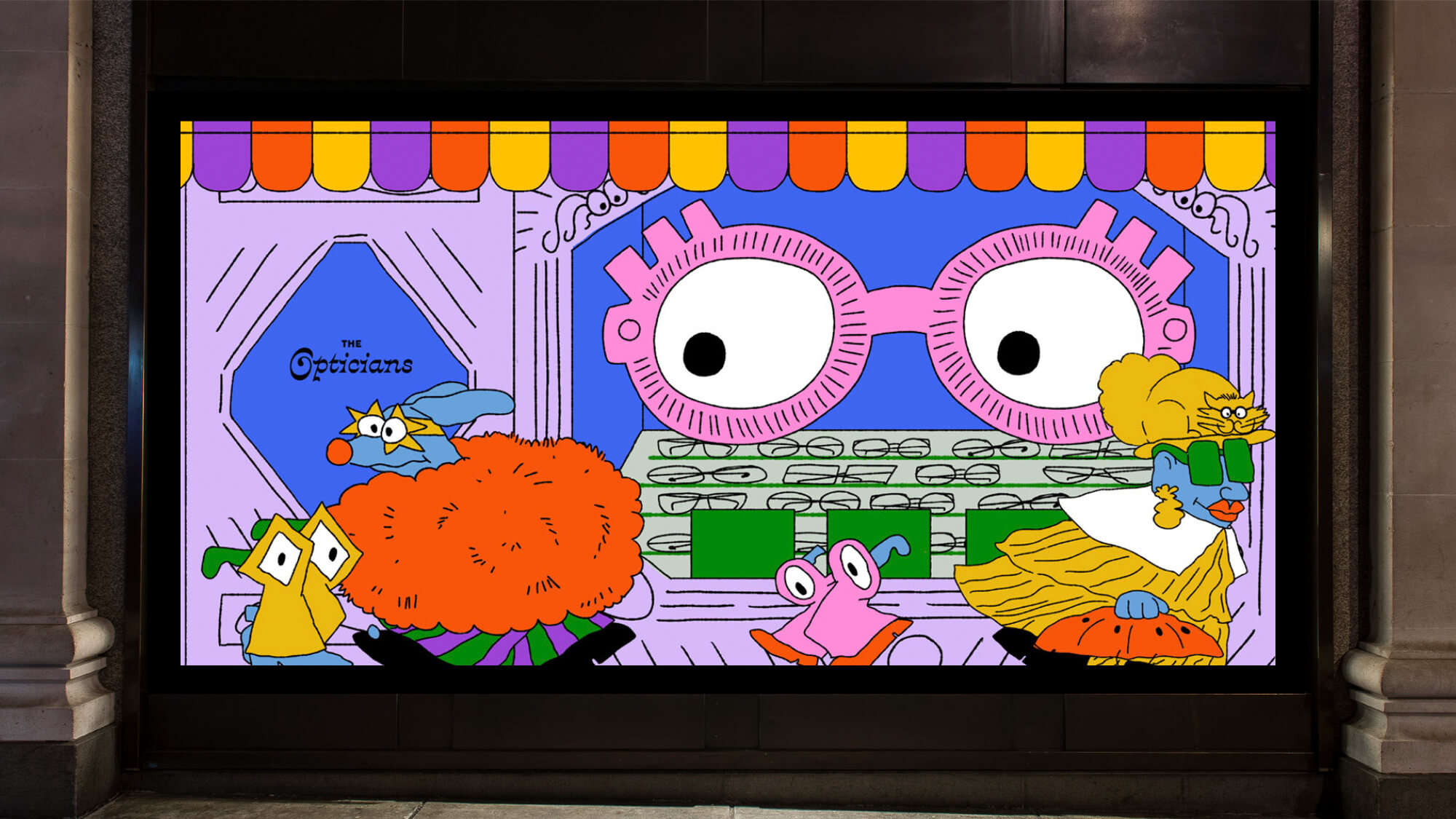
"The Opticians" by Angela Kirkwood
Can you tell us about a few of the designs you created?
Brindha: I’ve designed three window displays for Selfridges. The first one is "The Brasserie of Light", which is an Art Deco restaurant and bar inside Selfridges London. I tried to use different elements from the restaurant, one of them being the crystal Pegasus statue by Damien Hirst. The illustrations are also heavily embellished with patterns, which allows for an interesting display of different perspectives.
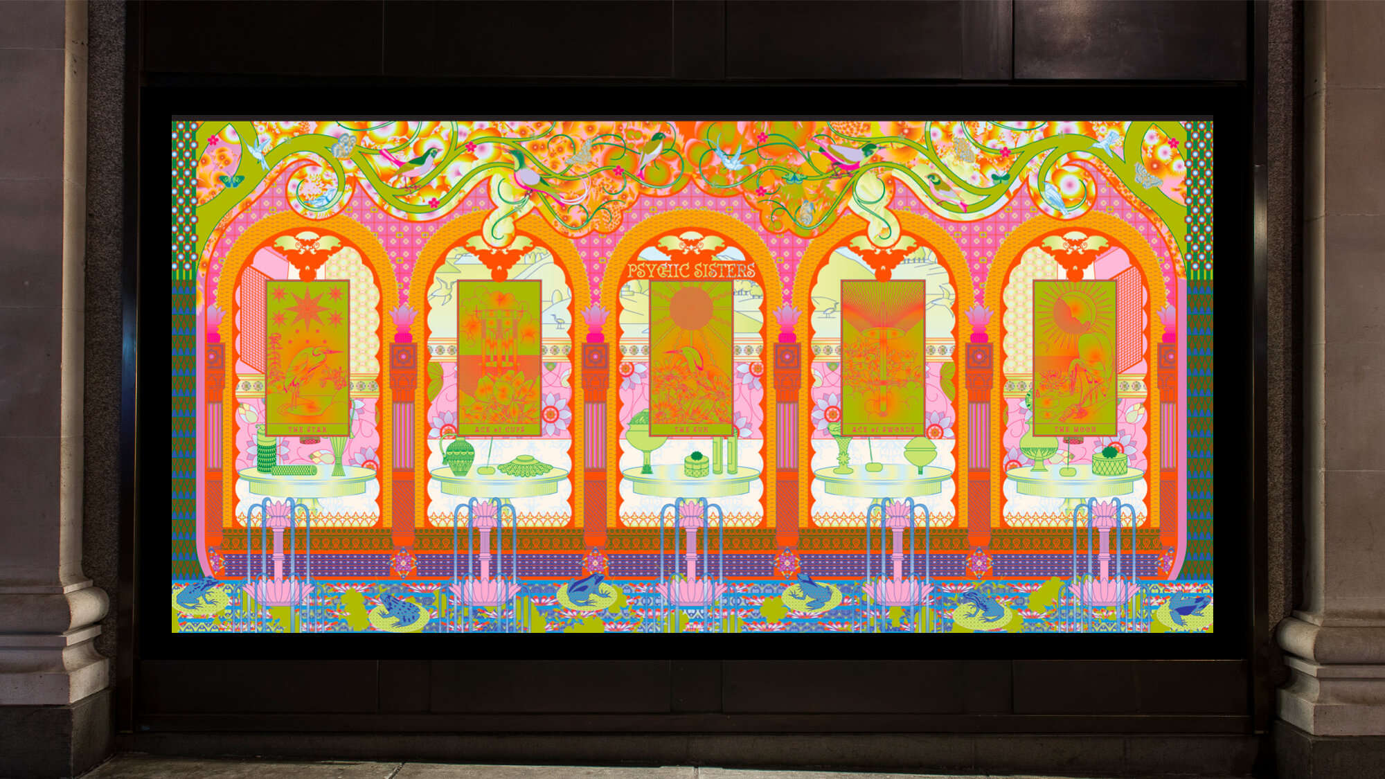
The second window I designed is the "Psychic Sisters". The five focal elements within the design are stylised tarot cards within archways that invite the viewer to peek into the future and connect with their spiritual self.
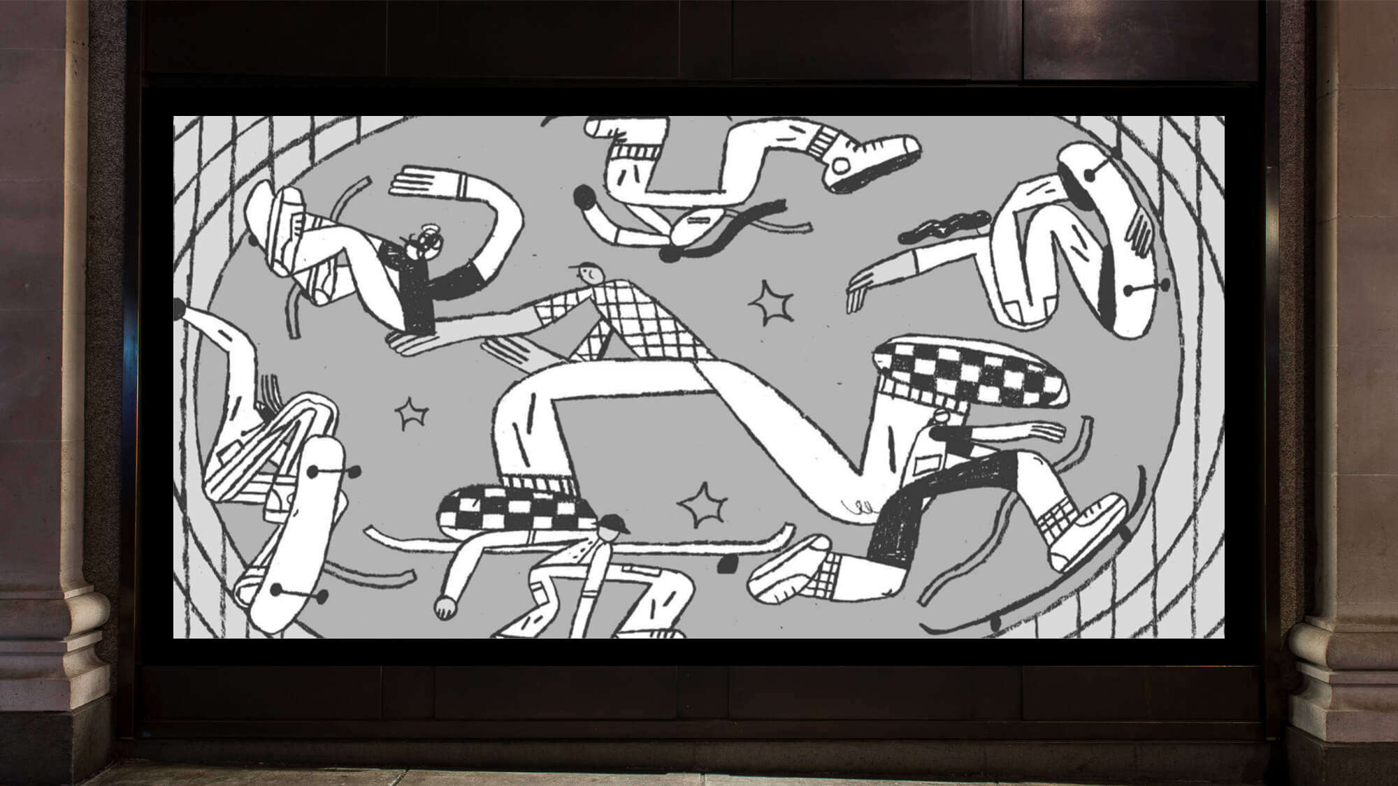
Lena: “The Skate Bowl” is inspired by Selfridges London’s skate bowl. I spent a lot of time observing and drawing skaters in real life to get a better understanding of their movements and silhouettes. I really wanted the scene to feel dynamic and fun, with skaters at different angles, upside down and floating within a round-edged space.
For the "Harry Gordon’s" window, the illustration is entirely drawn in coloured pencil, which allowed me to create all of these textures and gives the whole illustration a very handmade feel.
John: One of my windows is a giant slice of cake and a person holding a giant fork about to eat it. In one window, we’ve got a person with a giant cherry on their head, based loosely around ice-cream sundaes and desserts. I think they entertain me more than anybody else! I wanted them to be funny. That’s something we spoke about right from the start – we knew the windows were getting launched in early January, so they’re a bit of an antidote to the January blues.
Angela: The window designs I’ve done all feature fake shopfronts. I was thinking of them as shopfronts from alternative realities, so they all have quite fun and goofy characters. My favourite window is probably “The Opticians” because I love the fashion characters. There’s a little dog with star glasses!

"The Brass Rail" by Lena Yokoyama
What was it like to design at this scale?
Brindha: There were a few important considerations when designing at this scale, particularly ensuring that the work could be appreciated from far, as well as up close.
Lena: I wanted to include enough quirky details to create intrigue and create different narratives in the characters, but I also wanted it to be a well-balanced composition and not feel overwhelming.
Angela: When I was designing the windows, it was the first time I’ve designed for a 3D space, so that was a totally new challenge that I’ve never considered before. And then scale – as things go further back, you need to make them bigger, whereas things on the vinyl [sticker] on the window can be smaller and more detailed.
So, trying to think in a 3D space was definitely a challenge. At first, I was just like, “Erk!” But you pick it up!
How do you want people to feel when they see your windows?
Lena: I would love for them to feel the same amount of joy as I did in creating it. I really hope they inspire people who are walking past to take a minute out of their busy day, just to stop and look and enjoy my little illustrated imaginations.
John: I want people to feel happiness when they look at my work, because that’s the feeling that goes into it. Something instant and primary and joyful.
-
A mock-up of "Psychic Sisters" by Brindha Kumar
-
A mock-up of "The Opticians" by Angela Kirkwood
-
A mock-up of "The Skate Bowl" by Lena Yokoyama -
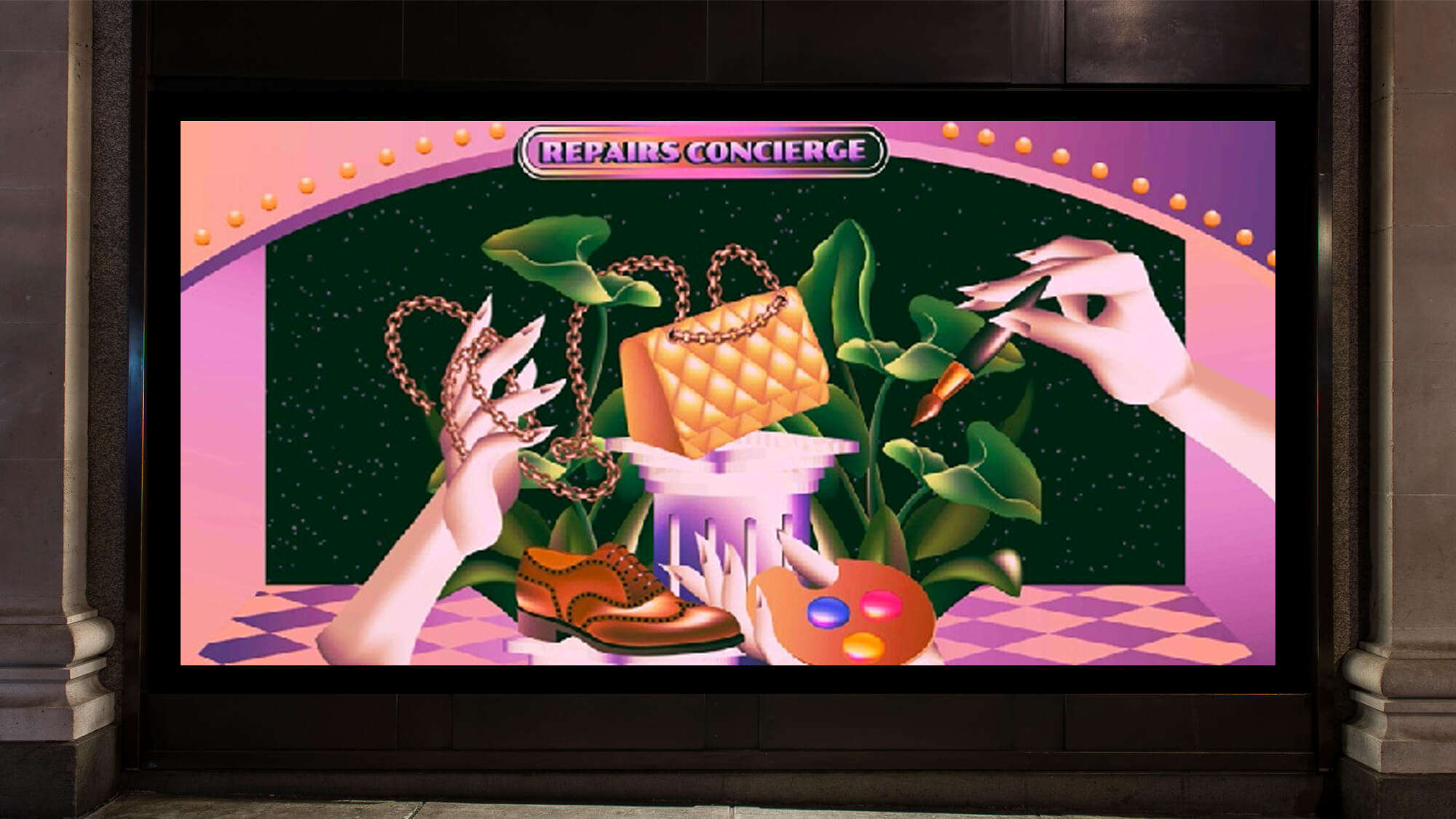
A mock-up of "The Repairs Concierge" by Paulina Almira
View the new Selfridges window displays at all our stores, including illustrations by LA-based artist Paulina Almira.
Images: Andy Broadhurst

SELFRIDGES CELEBRATES
Lovers, mothers, fathers, family and friends. Make life a little brighter with a Selfridges celebration.
Join Selfridges Unlocked

Your Key to extraordinary. Become a Keyholder and unlock exclusive invites, first looks, free delivery, monthly prizes and regular donations.